Showing posts with label Contextual studies term 2. Show all posts

Sunday, 4 May 2014

Drawing Project Contextual Research

One of the other huge things that influenced me on this project is this video i came across a while back.
I think that it shows a lot about todays society and relates a great deal to my project. 
It shows that people are too busy looking through a lens to appreciate life and take in the real experience. 
This basically depicts the idea of phenomenology and the way we experience things around us.


video from: https://www.youtube.com/watch?v=OINa46HeWg8

Thursday, 1 May 2014

Drawing project Notes

After Searching for a LONG time, i have finally found something that i've had in mind since thinking about the inital idea's for this project. 

http://www.tellyads.com/show_movie.php?filename=TA2216


image: http://www.pocketropolis.co.uk/blog/uploaded_images/vision.jpg
(the caption is a joke already placed on the image. Sometimes comedy is the best medicine right?)

This simple Vision Express TV advert made me think a lot a few years back. Everything we look at really is like taking a photograph that lasts for a second. Whether its something scenic or a glimpse of somebody you're passing on the street.
The advert always inspired me as it made me consider all of the things that we see that we don't really take in because we are too busy or not paying attention,
I think that this relates a lot to my project as the subjects in my sketches are similar to these snapshots that we see but might not think too much about. Instead i have captured them and taken note of the details in order to create the drawing itself.
Thinking about it, this tv advert made me think about the things i wanted to show in this project before i even started thinking about the project itself.


Drawing Project Development


For my final pieces in my drawing project i want to sketch as many observational 'snippets' of life as possible. Wherever we are, the people around us go ignored because of the way society has grown to communicate through technology and people have grown into a world where we speak more over social media than to the people we are next to on the bus or in a class. 
The entire object of the work is to show the things that we are ignorant to while we are looking at our phone or looking at a screen. 
I used the inspiration i got while exploring David Hockney's work by using the simple line drawings. Although still incomplete, i believe that in a collective piece it will look like the small moments captured by the conscious and subconscious mind all in one bulk piece but separate moments.
I also thought about when i read that an artists sketchbook is very personal and unique, i believe that this is true with this work as not one person sees the same as another. These pieces are things which i have personally experienced and noticed myself in my own life.

Self-Directed Project Research

Anger Management and Art Therapy
Art Therapy has been known to treat a number of things including anger management.
When we suppress anger we push it away and ignore it. This overwhelms us and only makes it manifest into a force that can lead to become destructive and worse than the initial feeling.
I personally find this to be true in my own life experiences. I find that the more i try and contain how i feel when i am stressed or angry, the final outcome is everything i bottled up let out all at once. 
My work is to show how the feeling build up into one manifested reaction. 
While creating my paintings, i felt like i was letting out the anger i felt in a juxtaposing way. Painting is sometimes such a calm and well thought-out process that it counteracts the feelings of irrational behaviour. 
This works as we focus all of our energy and thought process by channeling the anger into one source. 
While creating my own work, i tried to paint while in a situation that angered me, people pushing past while i was working or if i was having a bad day. During the process of painting, i found that concentrating on only the direction the paint was flowing and watching it fall from the brush to the canvas, it was extremely therapeutic. 
By creating my work while experiencing the emotion directly, i feel that the work is more truthful and expressive.
It also proves the theory of art therapy in the way that it channels the emotion into something creative, ultimately creating positive energy.


ref:http://arttherapyreflections.blogspot.co.uk/2011/11/using-art-therapy-to-release-anger.html

Self-Directed Project Development


The above are all experimental pieces from my self directed project sketchbook. I began looking into the subconscious and the way the mind reacts to our emotional environment. I liked the use of the watercolour to reflect the dreamy state of mind but i felt that the use of material wasn't very successful. 
I wanted to use a different style which was expressive and bold. After i looked at the Emotionally Vague survey i found that the dripping paint style looked well to copy the scribbled marks on the paper. I think that using my chosen topic of rage/anger/frustration the black paint created the right marks depending on how they were applied to convey the emotion i wanted to explore. 
I also liked the way which Johan Van Mullem uses spiralling patterns to create his work, i think that the way the paint drips onto the page has the same effect.

Tuesday, 29 April 2014

Artist: Johan Van Mullem

Johan Van Mullem is a Belgian artist that works in paint, sculpture and drawing.
Mullems work reflects that of Rembrandt and Francis Bacon. His paintings are mainly made using oil based ink on unprimed boards using both vibrant colours and earthy tones. 
His work is based on the things that the brain sees and experiences in our lifetime, as well as emotional information.


200 x 140 cm


60 x 40 cm


140 x 120 cm


180 x 140 cm

Mullems abstracted portraits are extremely intriguing, the swirled patterns reflect the process of the brain and show a lot of emotion. Clearly, the work uses a lot of motion to create the patterns and marks but also a variety of dark and vibrant colours which change the mood between each piece.
I like the way which the work shows that is was creating using certain movements, you can see where the brush was dragged to create a particular line.


Saturday, 19 April 2014

Drawing Project Thoughts

Continuing from my initial sketchbook of observational drawings, i want to move out of the book and produce a series of sketches for a bigger piece. I think that the best way to approach this is to create a large number of small drawings.

I want the audience for the work to look and see that the work is about things around us and maybe things we wouldn't usually pay attention to. To wonder who the people are and what their lives are like as well as other small details in life.

I want to create a number of drawings to display from my observational sketches and show them in a small collective piece together.


Observational sketches in A5 sketchbook

Friday, 18 April 2014

Self Directed Project Continuation

Using the research from emotionally vague, i decided to explore the concept of anger as a physical feeling. Surely this is down to personal experience and each individuals tolerance and control. Personally, i tend to think of anger as an emotion that seeps through the body, starting from one point slowly then rapidly spreading until you have the feeling of releasing your anger. 

Firstly, to begin expressing these emotions i thought about the motion i would use to show the first stages of the feeling. I chose black as the base colour for my work to show the initial feeling, the initial feeling when the feeling arises from a certain trigger. The feeling slowly begins to spread if the feeling continues, gradually getting worse. I experimented with this by dripping the black paint to show the feeling slowly seeping from the head until you can feel it through to your chest. I also kept the black as a solid black colour or as a background as these initial feelings may not be as intense, but it also serves the purpose of being a good contrast for the other colours. 

I then began to work with white paint, i tried using the drips off a paintbrush and expressing the emotion physically by dripping or throwing the paint onto the page or canvas. This contrasts very effectively with the black and makes the white seem intense. The white is a way of representing the mad surge of energy some might feel when being wound up or continuing to be aggravated by a cause. The action of the paint dripping and swirling off the brush itself was very mesmerising and somewhat calming itself, proving that visual expression is a therapeutic cure. 

Lastly, i chose to use a dark red paint to contrast the monotone and to show a sudden dash of impulsive action, maybe a final snap during an argument or the act of slamming a door, the breaking point of anger which is short but a powerful outburst.


Fractions of larger pieces using black varnish, red emulsion and white gloss varnish on fabriano paper


Wednesday, 9 April 2014

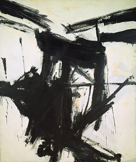
Artist: Franz Klein

Franz Klein was an american painter associated with Abstract Expressionism. In the 1930's Kline worked with figures, he painted landscapes and cityscapes. His black and white work suggests references such as bridges and industrial buildings. 
His black and white work came about with the help of a projector so that he could use his drawings to show the dynamic shapes. 
His work is inspired by the New York City landscape and created the shapes and lines using the projector to blur the lines until they became abstracted.


Mahoning, 1956, 203.2 x 254 cm


For my own work, i am more interested by the style rather than the subject. I think that the lines and brush strokes can show a lot of emotion, the speed which the lines were made and the width of the brush all have an effect on the outcome. 
I think that the large scale has a positive effect as the piece seems more intense. The use of black and white also gives it more of a simplified quality but at the same time it attracts more attention to the black on white rather than the fuss of colour.


ref: http://www.moma.org/collection/artist.php?artist_id=3148
http://www.abstract-art-framed.com/franz-kline.html

Monday, 7 April 2014

Self-Directed Project Context

Abstract Expressionism
To further develop my study into visualising the physical feelings of emotion, i wanted to look at how emotion has been explored throughout art in different eras. 
Abstract Expressionism is probably one of the best eras to explore as visually expressing emotions doesn't particularly take on a specific form.
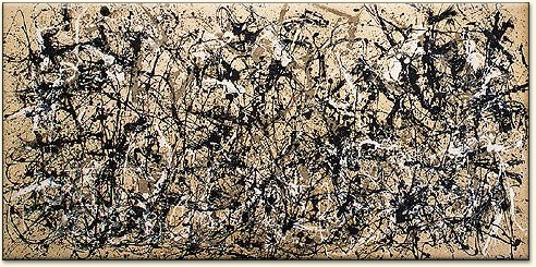
Jackson Pollock being an extremely influential artist in the 20th century was an obvious choice to study when looking at how to express something on canvas. 

Autumn Rhythm No. 30, Jackson Pollock, 1950

Jackson Pollocks process of work was influenced by his alcoholism, effecting his judgement and perspective. The works were created while in complete silence and during the process and were created using the subconscious.

"When I am in my painting, I'm not aware of what I'm doing. It is only after a sort of 'get acquainted' period that I see what I have been about. I have no fear of making changes, destroying the image, etc., because the painting has a life of its own. I try to let it come through. It is only when I lose contact with the painting that the result is a mess. Otherwise there is pure harmony, an easy give and take, and the painting comes out well.
—Jackson Pollock, My Painting, 1956 (History of Art: The Western Tradition)

"A dripping wet canvas covered the entire floor … There was complete silence … Pollock looked at the painting. Then, unexpectedly, he picked up can and paint brush and started to move around the canvas.  movements, slow at first, gradually became faster and more dance like as he flung black, white, and rust coloured paint onto the canvas." Hans Namuth, photogrpaher 1950

The next artist i decided to explore was Gerhard Richter whose work i saw in the Tate Modern Gallery in London. He created a series of six paintings named after the American Avant-Garde composer John Cage. The paintings are created like his earlier works using a squeegee and a mixture of layering and erasure. They are built up of layers of brush strokes and scrapings and rippled paint during the process of drying. Some paintings resemble a running river whereas some appear to have the texture and appearance of a concrete wall. Richter was listening to the music of John Cage while creating the pieces and quoted 'I have nothing to say but i am saying it.' Richter was attracted to the way the music was constructed with total randomness, which was reflected in his work. Critics have commented on the similarities with the fluctuations in the music and the paintings.

Detail of one of Gerhard Richter’s Cage Paintings, 2006.

http://vimeo.com/36088557

Gerhard Richters work inspires me in the way which music influences the type of work and the marks that are made. Music has a great influence on emotion and i believe that using this i can explore deeper into the physical feeling of emotion. I think that anger can be directly effected by music as it is for some people, an escape or a release for held back emotions. 

Willem de Kooning: Gotham News (1955)

William De Koonings work 'Gotham News' reflects the hustle and bustle of New York. It displays marks which suggest violent movements or even energetic strokes. Although the work appears to be made rather quickly, each stroke was placed with a lot of thought, a lot like Pollocks work, it was planned and worked upon until the artist considered to work to be complete.


Ref: 
https://www.tate.org.uk/art/artists/gerhard-richter-1841
http://www.albrightknox.org/collection/collection-highlights/piece:de-kooning-gotham-news/

Sunday, 6 April 2014

Drawing: Artist - David Hockney


David Hockney was born in 1937 and is an English painter, draughtsman and printmaker. Hockney has lived in Bridlington, Yorkshire and London but has also lived in California on and off for  over 30 years. Hockney is an important contributor to the pop art movement in the 1960s and has also been considered one of the most influential British artists in the 20th century. 
In the 1970's Hockney travelled a great deal and chose to work with line drawings. 

‘I never talk when I am drawing a person, especially if I’m making line drawings. I prefer there to be no noise at all so I can concentrate more. You can’t make a line too slowly, you have to go at a certain speed; so the concentration needed is quite strong. It’s very tiring as well. If you make two or three line drawings, it's very tiring in the head, because you have to do it all at one go, something you’ve no need to do with pencil drawings…Its exciting doing it, and I think it's harder than anything else; so when they succeed, they’re much better drawings, often.’ 
(Nikos Stangos, David Hockney by David Hockney, My Early Years, Thames and Hudson, London, 1976, p.158)

David Hockney was an acquaintance of Pablo Picasso who worked in the Cubist era and his work reflects the line drawings that he made. 


Portrait of Igor Stravinsky (1882-1971) 1920 (graphite on paper)  

The simplistic line drawings show the importance of line and how much of a subject you can draw using a little detail as possible. Using this method also benefits the artist as it means that you can sketch quickly in observational pieces and times where you need to create a larger number of drawings at a faster pace.
For my own practice, I intend to use the idea that using a single line makes observational sketches and drawing in public places faster and easier to create. 
In relation to my original intentions, i think that creating a collection of observational sketches will show people the things that we don't necessarily pay attention to, the small details we overlook and the people that we wouldn't normally associate with and wouldn't pay attention to. 


ref (http://www.waterman.co.uk/artists/225-David-Hockney/works/1857/)

Saturday, 5 April 2014

Drawing Project: Artist - James Jean


Image: One of James Jeans complete art works, Enoki II Acrylic on 3 canvases, 72 x 90" 2013


James Jean is an artist from New York and now lives and works in Los Angeles. After 2007 he left illustration and began working on personal projects and exhibitions. 
He studied at the school of Visual Arts in New York and began working as a cover artist for DC / Vertigo comics. 


images: http://www.jamesjean.com/sketchbook/2008_1.htm
Drawn on A5 moleskine sketchbook

James Jeans sketchbook work is created to use the sketches as a resource for future reference and to document ideas. It also serves a purpose to enhance the skill to draw. The images are drawn in public situations and hold a lot of cultural context such as drawings from a train, a coffee house or the people in the pictures all suggest travel. 
The drawings themselves are a tangle of detailed sections which overlap each other suggesting movement. The content appears to show situations of everyday life, it is sometimes unclear whether the subject is an acquaintance of the artist or a complete stranger. 
An artists sketchbook is actually quite a personal thing, the sketches on each page is a snapshot that the artist as an individual has observed in a way which another might not. 
James jeans sketchbook serves as a collection for ideas and references for his more detailed and main projects, but this collection of drawing made in every day life can be considered a piece in themselves. Each image appears to be peaceful and thoughtful. The subjects are looking away and appear to be working on something or looking at a particular object. In particular, i find the overlapping of the sketches to be rather interesting, its as if the artist got so far with one piece of a face or an arm when the subject moved, so the artist would have to begin the line again to copy the new pose.  

Using this inspiration i would like to take away the idea of creating drawings which show the natural poses and the peacefulness that you can see from James Jeans drawings. In public places where people go about their every day lives, it is interesting to notice small things that we normally wouldn't even pay attention to. 

This also links to my initial idea of looking at the world in front of us rather than being absorbed into this world of technology and seeing life through a camera lens or the screen of a mobile phone. 
To draw the figures itself requires paying attention to the details and looking harder at what is around you. During the process of drawing, i think that you tend to think about what you are observing in more detail and think about the subject you are drawing.


Wednesday, 2 April 2014

Self-Directed Project Research

One of the biggest influences for my self-directed project is a survey created to explore how feelings are felt physically.

"Emotions can be overwhelming. But not always so. They affect our thoughts and perceptions far more than we realise. It is well established that we are subliminally affected by visual media, and particularly in terms of unconscious emotions, drives and feelings.

I wanted to question how feeling can be experienced in the body, not simply in mind. I believe that we can use familiar tools to express understanding of experience, and not be restricted to the use of photographic stereotypes.

Can people describe their visceral feelings of emotion visually, and if so, would any patterns arise? In order to answer this, I had to develop some way of asking people to reflect on and describe their private feelings in a simple, repeatable manner, the results of which could be correlated visually and demographically.
By gathering concepts of feeling by word, colour and line and creating visual languages for anger, joy, fear, sadness and love - a kind of democratic visual language is created - a backwards-brand.
As a graphic designer, I am attempting to bring attention to the body's patterns of feeling and innate intelligence in a systematic but playful way.
Over time, this method may be developed into a therapeutic tool, and/or a means of visually representing feeling in an interactive, participatory manner."


Using this research i'd like to create a series of pieces using the bottom two images. I want to do this by using the paint to express visually how emotion effects us in the body.
The reason i wanted to focus on anger is because i believe that it is the strongest and most influential emotion. Personally, i find myself in situations where i would love to express myself freely when angry but it would be inappropriate. I wanted to visually express the way in which humans pent up these intense feelings rather than to react. This may not relate directly to anger, i want the pieces to relate to each individuals held back feelings, maybe even frustration from certain situations.  


http://www.emotionallyvague.com/index.php

Tuesday, 25 March 2014

Artist: Guy Denning

Guy Denning was born in North Somerset in 1965. He started using oil paint when he was a child and moved on to study painting in the 1980's as a degree but was unsuccessful. He continued to paint while studying Art history with the Open University and learned painting techniques from older painters he know in England. 
Since 1992 he has been exhibiting his work around Britain and since 2007 he began to exhibit in the US and the rest of Europe. 


Pictures: https://www.facebook.com/guydenning

Denning's work uses powerful brush strokes and scratches in the paint to express emotion. This effectively shows the intensity of the emotion which he is trying to portray. He also occasionally blocks out features such as the eyes or the mouth to emphasise the themes of darkness, despair and horror which seems to flow throughout a lot of his work. Although not much personal information is known about the artist, or even information about the work itself, it is unclear whether the work is portraying his own emotions or the expression of somebody else. 
Personally, i think that his use of material such as charcoal is successful. Both charcoal and oil paint gives the artist the opportunity to work into the surface and create some emotive marks and lines. The use of black and white is particularly effective as this detracts the attention from the colour and more to the use of the marks or brush strokes.

Tuesday, 18 March 2014

Drawing Project - 2nd Term

For the self-directed drawing project, I wanted to look at the way in which people socialise and live in daily life, the way technology has taken over most aspects of life including socialisation. Personally, I believe that people have become too reliant on the use of mobile phones, cameras, tablets and computers. I wanted to explore this more by considering the opposite of these things. This led me to explore the concept and theory of phenomenology. Phenomenology is the philosophical study of the structures of experience and consciousness. To put it shortly, phenomenology is the way in which we look at and consciously notice the things around us and our experience in daily life.   To use this information for my work, I considered ways in which to explore the concept of phenomenology by showing the things which people would normally not notice or be aware of while in a public place. Without looking at our mobile phones whether on the train, in the park or at a gig, we notice more about the smaller things that are around us and make us think about the things we wouldn't take a second glance at if we were so absorbed in our technology. To oppose these issues, I am going to take a visual diary of observational drawings of people and things which I notice throughout different situations to pick up in these things which tends to fade out as we become obsessed with our technological world.

Sunday, 16 March 2014

Self-Directed Project Work

For a starting point for my self-directed project i decided to work with portraits with a mix of influences with the work i have observed from other artists.
I used standard satin black paint as the consistency was suitable for the loose style of lines that i wanted to create. 
Although i am unhappy with the quality of this work, it serves simply as an experiment into the use of paint and the method of dripping paint in a mixture of controlled and uncontrolled ways. 
For this method i looked at the work of both Agnes Cecile and Jackson Pollock. Cecile's work appears to be directly influenced by pollock by the loose lines created by dripping paint.


For further development i wish to look into the work of other artists and ways to represent different emotion and symbols of releasing emotion.

Jackson Pollocks painting techniques are extremely influential in modern art, i think particularly the way in which he painted with a flat canvas and dripped paint from the brush in controlled strokes above the surface. Pollock painted from the subconscious, he created work that had never been done before. His work has been described as 'energy made visible.' This relates to my self-directed project in some ways as i am hoping to express something which cannot be seen through painting. The marks made by the paint all vary on the way the paint is 'thrown' onto the canvas, the speed, the angle and the height all vary the types of lines and paint marks. The essence of the subconscious is probably more prominent as Pollock struggled with alcoholism and this would have had a direct influence on his work. 
 

Agnes Cecile uses a very similar style, she also keeps her distance from her work, keeping the canvas flat while letting the paint fall onto the page. Her work is more controlled to achieve the detail in the portraits and they are produced with the conscious mind. She uses fast movements and will also use sticks rather than brushes to drip the paint. Although her drip paintings are monotone, simply using black on white, although occasionally using white paint or charcoal, i think that this is more effective when producing the portraits rather than mixing colour like in Pollocks pieces. I think that the negative space in the paintings are just as effective as the darker spaces and this creates a more aesthetically pleasing piece.


videos from YouTube